An elegant triplet of fonts
Posted on in Fonts
I use the following set of fonts.
| Type | Font |
|---|---|
| Sans Serif | PT Sans |
| Serif | Gentium Book Plus |
| Monospace |
|
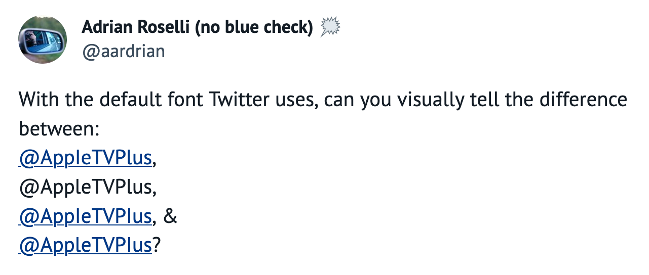
Sans-serif I v/s l
Many sans serif fonts fail to distinguish between uppercase I and lowercase l. Twitter's new font is an example of this.
On top of that, Twitter started dishing out blue ticks on subscriptions.
These two features combine to form deceptive Twitter usernames, as demonstrated in this tweet by Adrian Roselli.
Some famous fonts like Helvetica and Roboto fail at it.
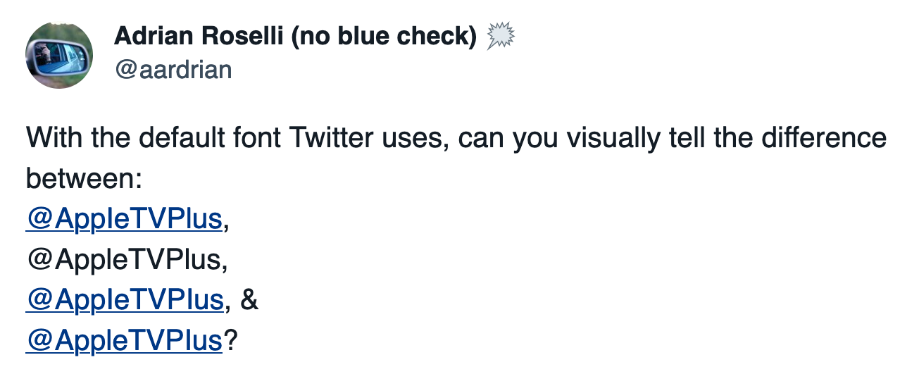
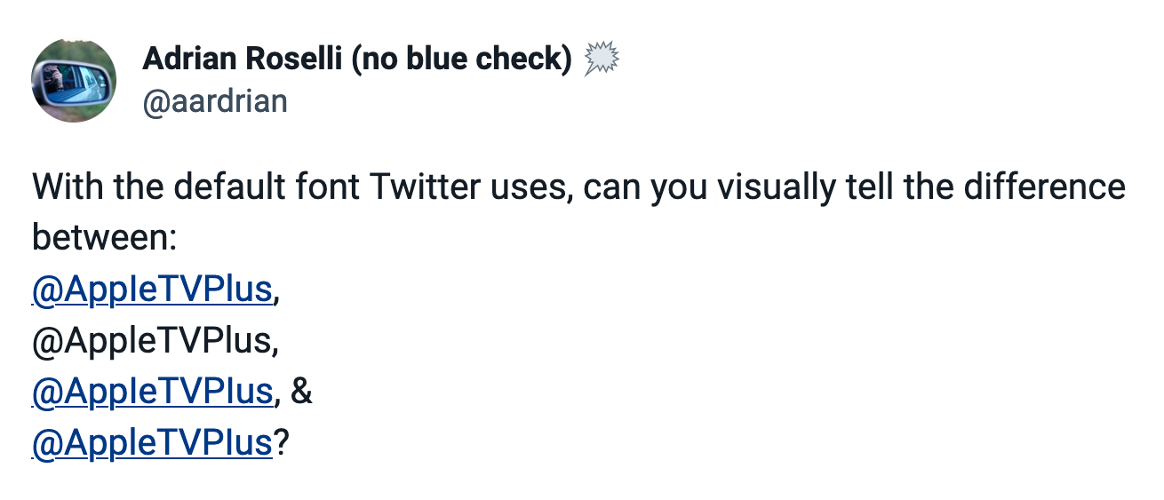
But PT Sans passes this AppleTVPlus test.
 Written by Jayesh Bhoot